
1. Gap
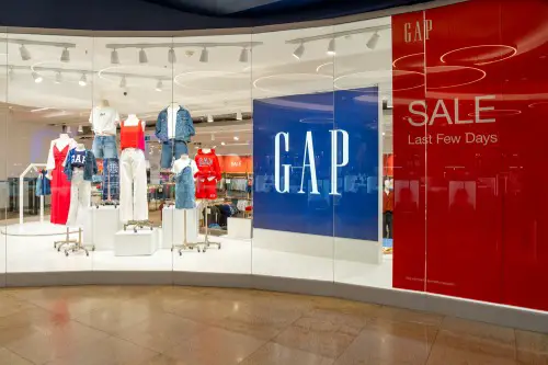
In the 90s, Gap was the definition of cool casualwear—those logo hoodies and khakis were everywhere. The brand leaned hard into its minimalist Americana vibe, and it worked. But in 2010, Gap attempted a rebrand with a new logo that backfired almost instantly, according to Tom Geoghegan of the BBC. It only lasted six days before they reverted to the original.
The new logo was supposed to be modern, but it felt corporate and soulless. The backlash was intense, especially on social media, which was just starting to flex its power. Consumers rejected the rebrand not just for the design but because it seemed to betray the brand’s identity. That failed rebrand became a case study in how not to alienate your base.
2. Crystal Pepsi
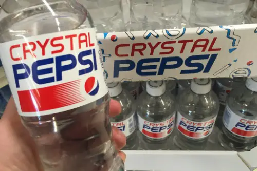
Crystal Pepsi exploded onto the scene in the early 90s as a futuristic, caffeine-free soda that looked like water but tasted like cola. It was a hit for a hot minute, thanks to a massive marketing push and curiosity factor. But Pepsi tried to reposition the drink with a wellness slant, which confused everyone. By the time they figured that out, it was too late, according to Natalie O’Neill of Thrillist.
People didn’t know what it was supposed to be—healthy? Cool? Just weird? It vanished quickly, and even though it came back briefly years later, it never regained its early buzz. The rebranding mistake wasn’t about a logo—it was about trying to give a novelty product staying power without a clear message. Sometimes, being too ahead of your time just doesn’t pay off.
3. Oldsmobile
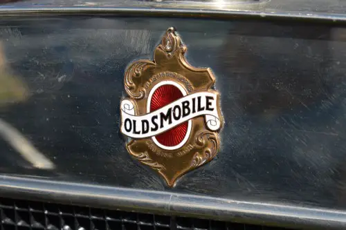
Oldsmobile was a staple of American driveways for decades and had a strong run in the 80s and early 90s. But as GM tried to modernize its image, Oldsmobile’s rebranding efforts clashed with its aging customer base. The “This is not your father’s Oldsmobile” campaign was meant to attract younger buyers. Instead, it alienated loyal fans and confused everyone else.
It didn’t help that the new models didn’t live up to the hype. The brand was stuck between its heritage and an identity it couldn’t quite build. Despite the push, sales kept declining until GM killed the brand, according to Lindsay VanHulle of USA Today. The rebrand tried to fix what wasn’t broken—and ended up breaking it.
4. Kodak
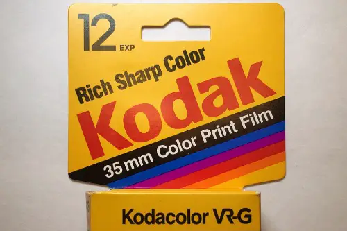
Kodak was synonymous with film photography and absolutely dominated the 90s. But as the digital revolution took off, Kodak tried to pivot—and fumbled hard. The company rebranded itself as an “imaging” company rather than embracing digital photography outright. It even developed digital cameras but hesitated to promote them, fearing it would hurt film sales.
That indecision cost them. By the time they leaned into digital, it was too late—competitors like Canon and Sony had already taken over. The 2006 rebrand felt outdated and vague, and consumers had moved on. Kodak filed for bankruptcy in 2012, a cautionary tale of too little, too late, according to Rupert Neate of The Guardian.
5. Polaroid
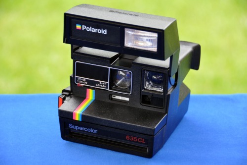
Polaroid was Instagram before Instagram. The instant photo brand had a cult following and a distinct identity. But when digital photography began taking over, Polaroid tried to reposition itself as a tech brand without a clear direction. The rebrand efforts scattered its identity—first going retro, then trying to go sleek and modern.
It just didn’t work. The company filed for bankruptcy twice, in 2001 and again in 2008, Claudia H. Deutsch of The New York Times explains. The brand has since been revived by different owners, but it’s more of a nostalgic niche than a household name now. Polaroid’s downfall shows how a strong identity can crumble if you try to chase trends too quickly.
6. JNCO Jeans
In the 90s, JNCO jeans were a teen rebellion symbol—those wide legs were practically parachutes. They were big in skate and rave scenes and had a devoted following. But when fashion trends moved on, JNCO tried to rebrand with slimmer cuts and toned-down designs. The fans didn’t want that, and new consumers didn’t bite either.
The brand’s identity was tied to being loud and in-your-face. Trying to make it subtle was a fatal mismatch. Their 2015 reboot failed to make waves, and JNCO quietly fizzled out again. You can’t rebrand a counterculture icon by making it mainstream.
7. Myspace

Myspace was the social media site before Facebook ate its lunch. It gave users a creative outlet to customize pages, share music, and connect. But in the late 2000s, it tried to rebrand as a music-centric platform, and things started going downhill. The focus shift confused users who weren’t there for music.
The site lost its social roots and became clunky and ad-heavy. By the time it tried a sleek redesign in 2013, everyone had already moved to Facebook, Twitter, and Instagram. The rebrand may have had vision, but it came years too late. Myspace remains a cautionary tale in social media evolution.
8. Yahoo!

Yahoo! was the internet for many 90s kids—email, news, chat, even search. It had everything under one digital roof. But by the 2010s, Yahoo! was struggling to stay relevant and tried multiple rebrands. The most notable was a 2013 attempt with a redesigned logo and Marissa Mayer’s leadership shift.
None of it really clicked. The brand lacked focus—was it a media company? A tech company? An email service? Users didn’t know, and that identity crisis led to a steady decline until it was sold to Verizon in 2017.
9. Sears
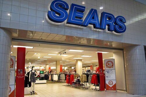
Sears was once the largest retailer in the U.S., and in the 90s, its catalogs and stores were still going strong. But as online shopping rose, Sears attempted multiple rebrands to stay afloat, with little success. One attempt repositioned it as a “lifestyle brand,” trying to compete with Target and Amazon. But the effort lacked cohesion and failed to modernize its aging image.
Instead of evolving its customer experience, Sears leaned into gimmicks and loyalty programs. Shoppers didn’t buy into it—literally or figuratively. The store closings began en masse in the 2010s. Sears’ rebranding never addressed the core issue: a failure to modernize where it mattered.
10. Blockbuster
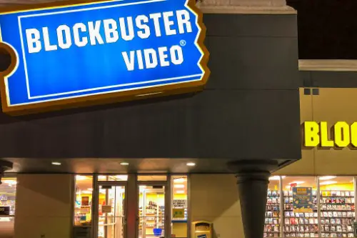
Ah, Blockbuster—the Friday night ritual. In the 90s, it was untouchable, with thousands of stores and a blue-and-yellow logo burned into pop culture memory. But when streaming began to take hold, Blockbuster tried to rebrand with DVD mailouts and its own online platform. The moves were clunky and too late.
They passed up a chance to buy Netflix in the early 2000s, and the rest is history. Their rebranding lacked agility and vision, and consumers noticed. By 2013, nearly all stores were shuttered. Now it lives on more as a punchline than a brand.
11. RadioShack
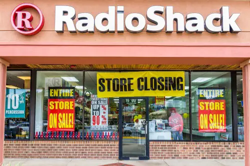
RadioShack was a tinkerer’s dream in the 90s—wires, batteries, and tech gadgets galore. But as consumer electronics got sleeker and big-box stores took over, RadioShack lost its niche. It rebranded in 2014 with the tagline “Do It Together,” trying to appeal to DIYers and young techies. It even ran a Super Bowl ad poking fun at its outdated image.
But it wasn’t enough. The stores were still cluttered and confusing, and the rebrand didn’t lead to a meaningful sales boost. They filed for bankruptcy the next year. RadioShack’s identity crisis was too deep for a catchy campaign to fix.
12. TCBY
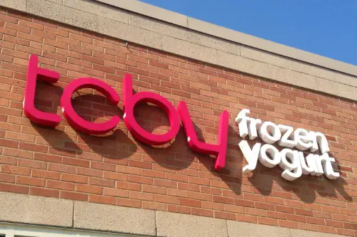
Remember when TCBY (The Country’s Best Yogurt) was everywhere in the 90s? Frozen yogurt felt fresh and indulgent, and TCBY led the charge. But as the healthy food trend evolved, TCBY rebranded with a brighter look and expanded menu. The result? It blended into a crowded market.
The rise of Pinkberry, Menchie’s, and other trendy froyo shops pushed TCBY to the margins. Its rebranding didn’t distinguish it enough—it tried to be everything to everyone. Many locations quietly closed, and it never regained its cool-kid status. Sometimes the original charm is what makes a brand work—and without it, TCBY melted away.