1. Lunchables’ Bright Yellow Tray
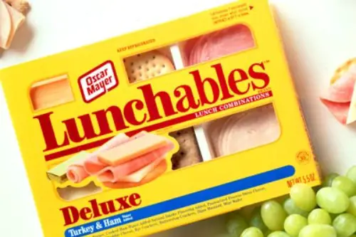
Lunchables didn’t just offer a quick lunch—they felt like a whole experience, according to Robin Levinson-King of the BBC. The iconic yellow plastic tray with sealed compartments made every kid feel like they were opening a personal, build-your-own feast. Introduced by Oscar Mayer in 1988, the packaging was a genius way to rebrand cold cuts for kids. The design made it feel special, like a mini meal kit decades before meal kits were a thing.
That bright yellow hue, paired with red accents and bold lettering, is impossible to forget. Whether it was the cracker-stacking Original, the pizza version with a mystery red sauce, or the fancy “Deluxe” ones with a mini dessert, the look stayed largely the same. And let’s be honest—half the appeal was just opening it. If you were a kid in the ’90s or early 2000s, seeing that tray meant lunch was going to be awesome.
2. Pop-Tarts Foil Wrappers
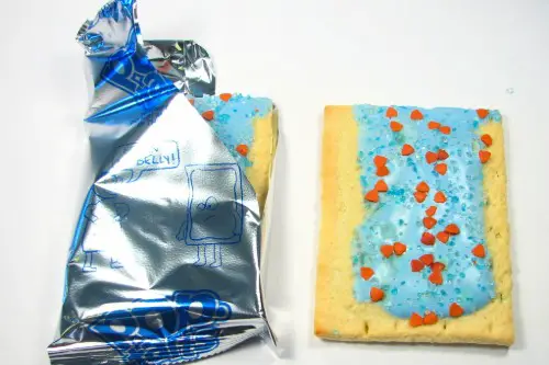
That crinkly silver foil with blue text isn’t just wrapping—it’s a time machine, Tim Carman of The Washington Post shares. Pop-Tarts, introduced by Kellogg’s in 1964, were a breakfast staple in many American homes. The design of the two-pastry packet hasn’t changed much in decades, which makes it instantly recognizable to anyone over 30. From Frosted Strawberry to Brown Sugar Cinnamon, the packaging always promised a sweet start to the day.
Those little toasty rectangles wrapped in foil felt like a special treat, especially when you got to sneak one in your backpack. The box designs have varied slightly over the years, but that inner foil? Practically sacred. If you ever sat waiting for your toaster to ping while watching cartoons, you know exactly what this wrapper means. That shiny pouch holds nostalgia in every crinkle.
3. Kool-Aid Jammers
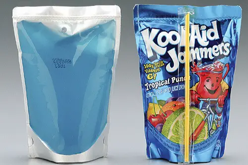
You knew it was party time when these showed up in the cooler, Joe Berkowitz writes in Fast Company. Kool-Aid Jammers took the classic Kool-Aid flavors and put them into see-through pouches with bold, tropical colors and the iconic Kool-Aid Man grinning right on the front. Launched in the late ’90s, the design was aimed squarely at kids, but every adult remembers that squeeze and slurp moment. The bright, juicy packaging made these a must-have for summer barbecues and birthday parties.
Even before you drank one, the pouch made an impression. That clear plastic showed off vibrant reds, purples, and blues that basically screamed fun. While the original Kool-Aid came in powder packets, the Jammers gave it a modern twist. The wild flavors, the smiling mascot, and that pouch—it’s etched in memory for anyone who grew up with sticky fingers and summer afternoons.
4. Crystal Pepsi Bottles
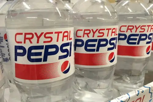
The clear soda in a clear bottle with a red, white, and blue label—how could you forget? Crystal Pepsi launched in 1992 with a ton of hype as a caffeine-free, “pure” cola alternative, Webb Wright of The Drum explains. It didn’t stick around long (it was discontinued in 1994), but the unique design left a big impression. It looked like water but tasted like cola, and the clear bottle made you do a double take every time.
The label featured Pepsi’s classic logo with a translucent twist, riding the early ’90s health trend of “clarity” and “purity.” It was marketed during Super Bowl commercials and seen as futuristic at the time. Although it flopped, those who saw it remember it vividly—because what other soda looked like that? For millennials, Crystal Pepsi is the soda that wasn’t around long, but it’s unforgettable all the same.
5. Capri Sun’s Silver Pouch
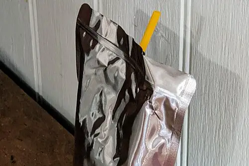
There’s just something about that shiny silver pouch that instantly transports you back to school lunches in the late ’90s and early 2000s. Capri Sun’s minimalist, metallic packaging made it stand out on grocery shelves—and made stabbing the straw in feel like a small victory. The drink was first introduced in the U.S. in 1981 but saw its popularity boom in the ’90s. That silver pouch hasn’t changed much, and that’s exactly why it’s still so familiar.
Capri Sun was marketed to kids but clearly designed to appeal to parents who wanted a “natural” juice option. It often came in those 10-pack cardboard boxes with colorful fruit illustrations that somehow made the drinks seem healthier than they were. The packaging was also weirdly durable; you could crush it, throw it, and it would still survive a school backpack. Anyone who ever struggled to pierce that tiny straw knows: once you see that pouch, it’s burned into your memory.
6. Trapper Keeper Binders
Technically not food, but Trapper Keepers were a form of packaging—for your entire academic life. These brightly colored plastic binders with velcro flaps were the ultimate status symbol in elementary and middle school. Designed by Mead and first released in 1978, they hit peak popularity in the ’80s and ’90s. The outside featured wild geometric patterns, neon gradients, and even licensed characters like Lisa Frank and Hot Wheels.
If you owned one, you probably remember the way the velcro sounded when you peeled it open in class. The inside had slots for folders and notes, and the durable cover felt like armor for your homework. It wasn’t just about organization—it was about self-expression. One glance at that bright flap, and anyone over 30 knows exactly what it meant to walk into class prepared and cool.
7. Blockbuster VHS Cases
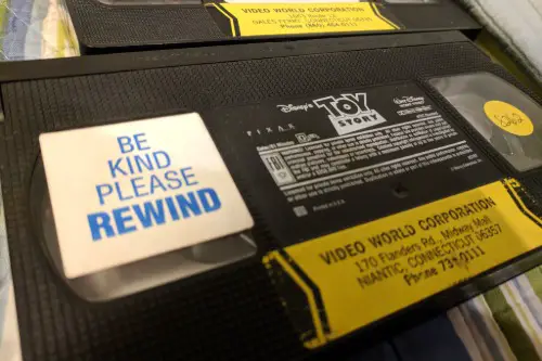
They were chunky, plastic, and slightly scuffed, and they smelled faintly of popcorn and carpet cleaner. The iconic black clamshell VHS cases from Blockbuster were a weekend ritual. With that bright yellow-and-blue Blockbuster logo sticker on the spine, you always knew you were in for movie night. Blockbuster dominated the rental scene in the ’90s and early 2000s, and its packaging became a visual shorthand for “fun incoming.”
The cases were designed to be reusable and durable, with rental barcodes and warning labels that made you feel like you were borrowing something important. Rewinding before returning was serious business, too—hence the “Be Kind, Rewind” sticker on many of them. For kids over 30, seeing one of these cases now is like hearing a dial-up modem—it hits a deeply nostalgic nerve. You didn’t just rent a movie—you brought home the whole experience.
8. Tang Orange Canisters
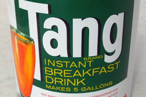
Tang wasn’t just a drink—it was “the drink the astronauts took to space.” First sold in the 1950s and popularized in the ’60s thanks to NASA, Tang became a kitchen staple well into the ’80s and ’90s. The tall, curved plastic canister with its bright orange lid and label was hard to miss. The packaging practically glowed on pantry shelves, promising instant citrus joy.
Mixing a spoonful into water felt like science—especially when the powder puffed up into the air. The container was resealable, which meant it stayed in kitchens for months at a time. Whether or not you liked the taste, you definitely remember the look. And let’s face it: that canister shape is forever burned into memory thanks to its space-age appeal.
9. Juicy Juice Boxes
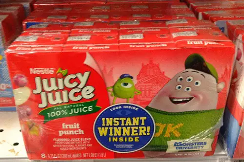
That squat little juice box with the bendy straw glued to the back was a lunchbox essential. Juicy Juice, launched by Libby’s in the 1970s and later acquired by Nestlé, emphasized that it was made from 100% juice—something parents loved. The packaging featured giant, realistic images of apples, grapes, and oranges with that familiar green and purple color palette. Even the font feels nostalgic in that soft, round, ’90s way.
What really stuck was the experience: shaking the box, poking the straw in just right, and sipping it through a thin plastic tube. It felt grown-up and kid-friendly at the same time. Those multipack boxes were common in every household with kids, and the packaging barely changed over decades. If you had a lunch packed by someone who cared, chances are Juicy Juice was in there.
10. Tupperware’s Harvest Gold & Avocado Green
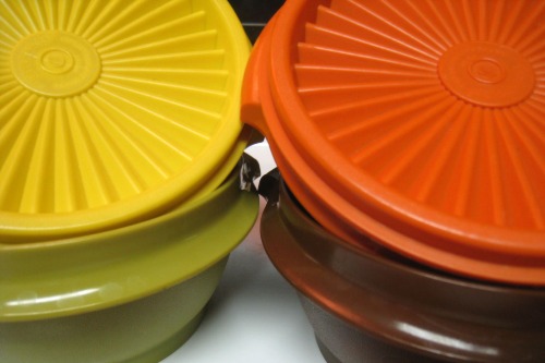
Long before “meal prep” was a thing, your mom or grandma probably had a mountain of these in the kitchen. Tupperware in the 1970s and ’80s came in muted shades like harvest gold, avocado green, and burnt orange—colors now deeply associated with retro kitchens. These containers weren’t flashy, but they were everywhere. Their sturdy lids and stackable shapes made them the gold standard in leftover storage.
The design hasn’t changed much because it doesn’t need to—the look was so embedded in American households. Hosting a potluck or saving Thanksgiving leftovers? Tupperware was the universal solution. If you’re over 30 and ever opened a fridge growing up, odds are you saw one of these old-school containers keeping something “still good” inside.
11. Nesquik Powder Tubs
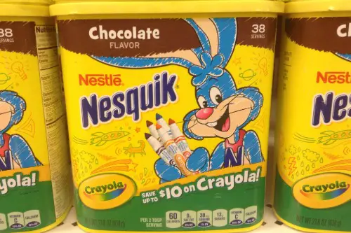
The chubby yellow tub of Nesquik chocolate powder was a sweet staple in many American kitchens. With the grinning bunny mascot and curved plastic container, it was practically begging to be opened and stirred into milk. Originally known as Nestlé Quik before rebranding to Nesquik in the late ’90s, the packaging has stayed true to form. That yellow tub with a pop-top lid is an iconic pantry item.
Opening the container released a chocolatey puff that instantly made you thirsty. You didn’t even need the instructions—you just knew the scoop-to-glass ratio. That distinctive shape and bright label made it a kid magnet in the grocery store. And honestly, it’s still hard to resist when you spot it in the aisle today.
12. Eggo Waffle Boxes
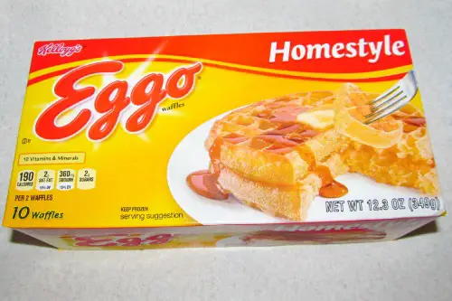
“Leggo my Eggo!” was more than a catchphrase—it was a childhood morning mantra. Introduced in the 1950s but truly popularized in the ’80s and ’90s, Eggo waffles came in bright yellow boxes with bold red letters and mouthwatering images of syrup-drizzled waffles. The packaging screamed convenience and comfort, especially for sleepy school-day mornings. That yellow box in the freezer was a promise of a hot breakfast in minutes.
Eggo leaned into kid appeal with characters and playful taglines over the years, but the box’s look didn’t stray far. Even adults buying them today probably do a double take, flooded with breakfast memories. There was something magical about sliding a couple waffles into the toaster and smelling them crisp up. The box might be recyclable, but the nostalgia definitely isn’t.
13. Pringles Cans
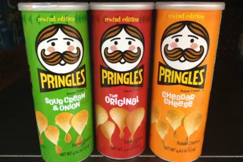
That tall, cylindrical canister with the pop-off lid and neat stack of chips inside? Pure genius. Pringles, launched nationally in 1975, came with a design unlike any other snack on the market—and it’s barely changed since. The red Original can with Mr. Pringle’s mustachioed face is burned into the American snack psyche. Unlike bags of chips, Pringles didn’t crush easily, making them perfect for lunchboxes and road trips.
You didn’t just eat Pringles—you pulled them out like poker chips, and if you were fancy, maybe even duck-lipped two into your mouth. The shape of the can made them endlessly stackable, collectible, and oddly fun to reach into. The engineering was part of the appeal, but so was that unmistakable packaging. If you’re over 30, seeing that can feels like flipping open a tab from your childhood.