
1. Rotisserie Chickens
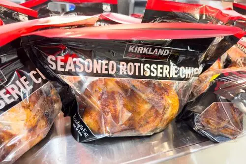
Ah, the humble rotisserie chicken — the crown jewel of every grocery store’s “home-cooked” illusion. The smell alone is designed to hit you right in the nostalgia, wafting through the aisles to make you think of Sunday dinners. But those golden birds aren’t roasted out of love; they’re a strategic upsell, often made from chickens that are close to expiring. Stores know you’ll grab one because it feels like comfort food without the work.
And it works — sales data consistently shows that rotisserie chickens are one of the top impulse buys in supermarkets. They’re cheap, smell amazing, and conveniently placed near the entrance or checkout to tug at your “I deserve this” impulse. But the warm lighting and “freshly roasted today” signs are all part of the trick. It’s comfort disguised as convenience.
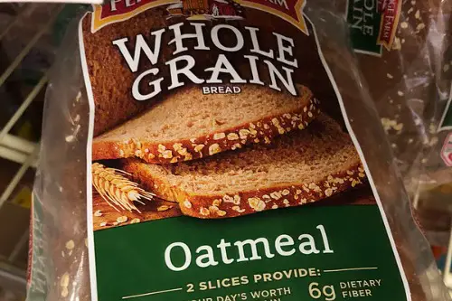
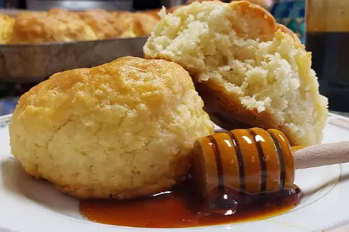
2. Freshly Baked Bread

The smell of baking bread in a grocery store isn’t there by accident — it’s marketing magic. Many chains actually use par-baked loaves shipped in frozen from factories, then finish them in-store to fake that “homemade” vibe. The idea is to make you feel cozy and grounded, like you’ve walked into a rustic farmhouse kitchen. In reality, it’s an industrial bakery operation with a side of psychology.
Studies show that the scent of fresh bread can increase sales of unrelated items because it triggers feelings of warmth and comfort. So when you catch that whiff near the bakery section, it’s not just hunger — it’s nostalgia being monetized. The “local bakery” signs and paper wrapping complete the illusion. It’s genius, but not exactly grandmother’s recipe.
3. Mason Jar Packaging
Ever notice how jams, sauces, and even salad dressings are suddenly packed in mason jars? It’s a design trick that screams “handmade” and “small batch,” even when the product comes from a massive factory. Those rustic jars tap into the farmhouse aesthetic that Americans associate with simplicity and authenticity. But really, it’s just glass with a marketing degree.
The truth is, mason jars cost more to produce and ship — but brands pay up because they sell an idea, not just a condiment. They want you to picture someone stirring jam in a country kitchen, not a worker on an assembly line. The homey packaging creates emotional value that justifies a higher price tag. You’re buying the vibe as much as the product.
4. Store-Brand “Artisan” Breads
When a loaf says “artisan,” it feels like it came straight from a local bakery — but in most grocery stores, it’s mass-produced. Supermarkets figured out that slapping on words like “rustic,” “crafted,” or “hearth-baked” can make you feel special about something made by machine. The uneven crusts and flour dusting are all part of the illusion. It’s marketing dressed up as authenticity.
These breads often come from industrial bakeries that supply multiple chains under different “artisan” labels. You think you’re getting something homemade, but it’s the same recipe everywhere. It’s the grocery store equivalent of fast fashion: designed to look bespoke, produced at scale. Still, it’s hard not to fall for it — especially when it’s warm.
5. Pre-Packaged “Homestyle” Meals
“Homestyle” is one of those words that means absolutely nothing but feels like everything. Those frozen casseroles and mashed potatoes promise grandma’s touch, but they’re packed with preservatives and stabilizers. The idea is to make you feel cared for, like someone made dinner for you. In reality, it’s comfort food engineered by a lab, not love.
Food companies use “homestyle” because it taps into nostalgia and emotional hunger. It’s shorthand for “familiar and safe,” which is irresistible after a long workday. The labels might even feature cozy fonts and gingham patterns to drive the illusion home. It’s marketing psychology cooked to perfection.
6. “Locally Sourced” Signs
Walk into almost any store now and you’ll see a “locally sourced” section with chalkboard-style signs and cute farm icons. It’s meant to make you feel like you’re supporting nearby farmers, even if the product was just packaged locally. Many times, “local” means “within 400 miles,” which isn’t exactly the farmer’s market vibe they’re selling. But it feels good to believe it.
Grocery chains know consumers equate “local” with fresher and more ethical. So they stretch the definition to include anything they can justify. You feel connected to your community — even if your “local” tomatoes came from three states away. It’s the illusion of belonging, bottled up in a produce sticker.
7. “Farmhouse” Labels

“Farmhouse” may be the most overused grocery store adjective in America. From soups to crackers, it’s supposed to conjure images of weathered barns and wide porches. The reality? Most of these products are made in huge facilities nowhere near a farm. The word sells a story of simpler times that never really existed.
Designers deliberately use muted colors, cursive fonts, and watercolor farm scenes to make the packaging feel handmade. It’s comfort by design, not by recipe. You’re meant to think of slow cooking and rural charm, even when it’s a microwave meal. And it works because everyone secretly wants a taste of “the good old days.”
8. Seasonal Scented Candles in the Grocery Aisle

Those cinnamon and pumpkin-scented candles near the checkout aren’t there just for ambiance. They’re strategically placed to trigger emotional warmth — literally “selling” you the scent of home. Studies show that familiar scents can influence buying behavior, making you linger longer and spend more. That’s why they always appear right before the holidays.
The labels read like cozy poetry: “Harvest Hearth,” “Maple Morning,” “Warm Apple Pie.” They’re designed to remind you of family gatherings, not fluorescent aisles. It’s nostalgia in wax form. You’re not just buying a candle — you’re buying a mood.
9. “Grandma’s Recipe” Branding
Slapping “Grandma’s Recipe” or “Old Family Recipe” on a label instantly adds fake credibility. But spoiler: most of these “family recipes” were invented by marketing teams decades ago. It’s shorthand for “trust this — it’s been around forever.” The homey imagery is powerful, even when it’s entirely fictional.
The font usually looks handwritten, and the packaging might include a friendly, smiling grandmother illustration. It’s all about evoking a sense of love and legacy. You feel like you’re buying something passed down, not mass-produced. But it’s just nostalgia in a jar.
10. Handwritten Chalkboard Signs
You know those cute chalkboard signs near the bakery or produce section? They’re not written by a friendly clerk with a piece of chalk — they’re printed to look that way. The casual handwriting font makes the store feel smaller and more personal. It’s meant to say, “We know you,” even though you’re in a national chain.
Supermarkets use this style because it softens the shopping experience and creates a sense of intimacy. It makes everything look fresh and local, even if it’s not. It’s the illusion of community through typography. Clever, right?
11. “Country” or “Southern Style” Branding
Products labeled “Country Style” or “Southern Kitchen” sell an image of warmth and tradition. But behind the gingham patterns and “made with love” slogans are the same industrial processes as everything else. The goal is to make mass production feel personal. It’s marketing that leans hard on regional nostalgia.
It’s not that these products are bad — they’re just wearing a costume. The branding is designed to connect with your sense of identity and family memory. You think you’re buying culture; really, you’re buying comfort in a can. That’s the trick.
12. “Small Batch” Ice Cream

“Small batch” sounds artisanal, like a local creamery made it in a tiny kitchen with care. But most “small batch” ice creams come from large-scale facilities that run dozens of “small” batches a day. It’s a marketing term with no legal definition. It just feels more authentic than “factory made.”
The packaging usually leans rustic — kraft paper tones, script fonts, minimal design. All of it tells you this is special, not your average pint. And because you believe it’s hand-crafted, you’ll pay extra. The cozy story justifies the premium.
13. “Made with Real Butter” Claims

Butter is shorthand for homemade. When you see “made with real butter” on cookies or cakes, you immediately imagine a family recipe — not a factory line. It’s technically true, but the amount of butter might be minimal compared to other cheaper fats. The phrase is just there to evoke old-fashioned baking.
This trick works because butter feels wholesome and nostalgic. It’s comfort food gold. The phrase doesn’t guarantee quality — it guarantees a feeling. You picture warm kitchens and cookie sheets, not conveyor belts.
14. “From Our Kitchen to Yours” Slogans
Finally, there’s the ultimate homey lie: “From Our Kitchen to Yours.” It’s meant to make you picture an apron-clad cook, not a corporate kitchen. The language bridges the emotional gap between industrial food production and the warmth of a homemade meal. It’s a line built entirely out of sentiment.
Brands use it because it works — it humanizes the product and builds trust. It’s vague enough to feel personal but not legally risky. You feel like someone cared enough to cook for you. In truth, it’s just a line dreamed up by someone in marketing, not someone in a kitchen.
This post 14 Grocery Store Items That Only Exist to Trick You Into Feeling ‘Homey’ was first published on American Charm.