1. Smokey Bear
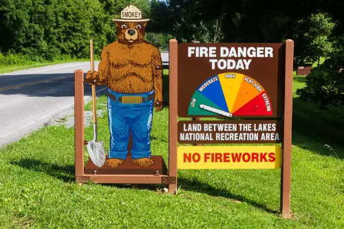
“Only YOU can prevent forest fires” wasn’t born from government policy—it was an advertising campaign. In 1944, the U.S. Forest Service and the Ad Council created Smokey Bear to raise awareness about wildfires during World War II. A real bear cub rescued from a New Mexico wildfire in 1950 became the living embodiment of the cartoon. He soon appeared on posters, radio shows, and even kids’ lunchboxes.
Smokey became one of the most recognizable public service mascots in history, and his message worked—wildfire prevention improved nationwide. He represents responsibility and environmental stewardship, ideals that stretch far beyond the original campaign. But make no mistake: Smokey was designed to sell an idea just like any product. His origin as a marketing mascot makes him both an advertising success story and a moral icon.
2. Uncle Sam
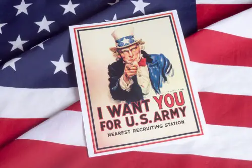
Before Uncle Sam became a personification of America itself, he was basically a branding campaign for U.S. military recruitment. The “I Want YOU” poster, created by artist James Montgomery Flagg in 1917, turned an old nickname into an unforgettable face. The image was inspired by earlier British recruitment posters but struck a uniquely American tone—stern yet patriotic. Over time, Uncle Sam went from war propaganda to a symbol of national identity and pride.
The name “Uncle Sam” likely came from Samuel Wilson, a meat packer from New York who supplied barrels of beef to the Army during the War of 1812. His initials—U.S.—were stamped on the barrels, and soldiers jokingly said the food came from “Uncle Sam.” The story spread, and cartoonists started personifying the U.S. government as a man named Sam. What began as a nickname for military rations evolved into one of the country’s most enduring national symbols.
3. The Michelin Man
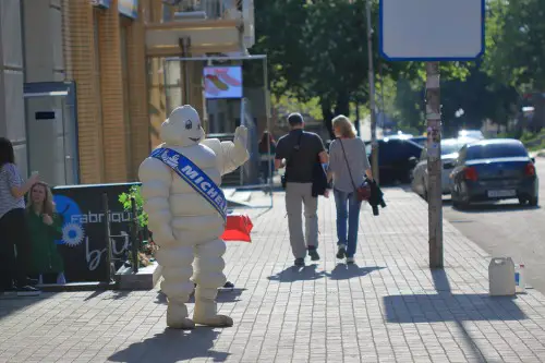
Known in France as “Bibendum,” the Michelin Man began as a quirky mascot for a tire company in 1898. Early versions showed a plump figure made entirely of stacked tires, raising a glass of nails and glass shards—because he could “drink up” road hazards. It was a playful way to show how durable Michelin tires were at a time when driving was still a novelty. Americans eventually embraced the character, who became a global ambassador for road safety and adventure.
Today, the Michelin Man represents much more than tires—he’s also tied to the famous Michelin Guide, which ranks fine dining around the world. That leap from tires to culinary prestige is one of the greatest branding pivots in history. The company’s goal was to encourage people to drive more, thus wearing out their tires faster. In a roundabout way, a goofy tire man helped make road trips—and even haute cuisine—part of modern American life.
4. The Pillsbury Doughboy
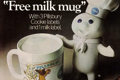
That giggling little guy named Poppin’ Fresh was born in 1965 to make refrigerated dough seem fun and friendly. The Pillsbury Doughboy appeared in commercials emerging from a tube of dough, poked in the belly, and giggling adorably. The campaign was meant to humanize a product that felt sterile—packaged dough in a can. And it worked; Pillsbury’s sales soared.
Over time, the Doughboy became a cultural touchstone, representing comfort food and family baking traditions. He starred in hundreds of ads, appeared on talk shows, and even had his own line of merchandise. What began as a cute sales gimmick became an emotional symbol of warmth and home life. That’s not bad for a character made out of flour and marketing genius.
5. Tony the Tiger
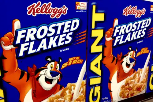
Tony the Tiger debuted in 1952 as the face of Kellogg’s Frosted Flakes, and his booming “They’re Grrreat!” became instantly iconic. The mascot wasn’t the only contender—Kellogg’s tested several animal characters—but Tony roared ahead with charm and confidence. His design evolved from a simple cartoon to a muscular, sports-loving cat who symbolized energy and positivity. Kids loved him, and parents didn’t mind the message about strength and activity.
Tony’s upbeat attitude helped Frosted Flakes stand out in a crowded cereal market. He became the embodiment of American optimism and family values, reinforcing the idea that breakfast fuels success. The character’s longevity proves how effective emotional branding can be. Even decades later, that deep, friendly roar still sells cereal and nostalgia in equal measure.
6. The Jolly Green Giant
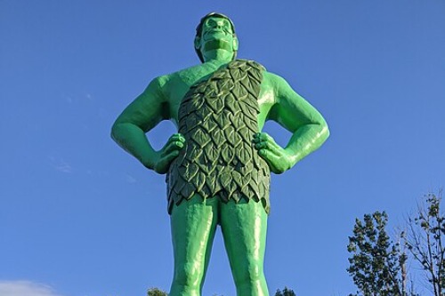
The Jolly Green Giant started as a somewhat creepy advertising figure for canned peas in 1928. Originally dark and grim-looking, he was soon redesigned into the smiling, towering mascot we know today. His booming “Ho, Ho, Ho!” turned him into a friendly symbol of freshness and abundance. He made eating vegetables feel like an adventure instead of a chore.
The character came from the Minnesota Valley Canning Company, later renamed Green Giant because of his popularity. He personified the bounty of the American heartland and the promise of better nutrition through modern farming. Over time, he evolved from a brand mascot to a wholesome figure of rural Americana. Few ad characters have so perfectly blended fantasy with food marketing.
7. Mr. Peanut
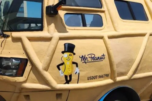
Mr. Peanut, with his top hat, monocle, and cane, was introduced in 1916 as the face of Planters. The company held a contest for a mascot, and a 14-year-old boy drew the original design. Planters refined it into the elegant, debonair peanut we know today. His sophisticated image helped elevate peanuts from cheap snacks to classy treats.
Through wars, recessions, and countless ad trends, Mr. Peanut has remained one of America’s most consistent brand icons. He’s been a symbol of both nostalgia and reinvention—remember when he “died” in 2020 and was reborn as “Baby Nut”? That move showed how even century-old mascots can adapt to pop culture’s fast pace. From roadside billboards to social media memes, Mr. Peanut proves that charm sells.
8. Aunt Jemima
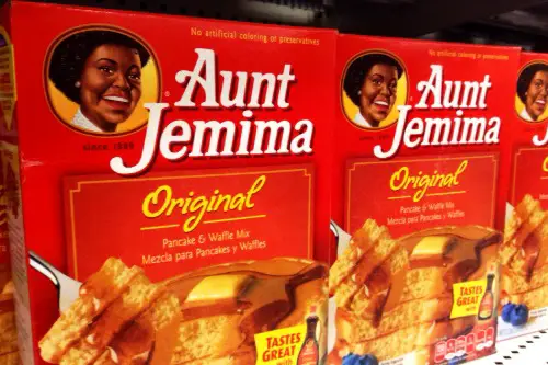
Aunt Jemima began as a caricature in 19th-century minstrel shows and was adopted by the Pearl Milling Company in 1889 to sell pancake mix. The character embodied a problematic “mammy” stereotype, but for decades, she was marketed as a warm, comforting face of Southern hospitality. Advertising campaigns showed her smiling and cooking, reinforcing ideas about domesticity and race. The brand became one of the most recognizable in the country, though for complex reasons.
In recent years, the company retired the character entirely, acknowledging its racist origins. Yet her story is a crucial part of understanding how American advertising shaped—and reflected—social values. Aunt Jemima was one of the first brand mascots to become a household name nationwide. Her evolution from advertising gimmick to cultural reckoning says a lot about how symbols change with the times.
9. Betty Crocker
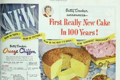
Betty Crocker never existed, but her name first appeared in 1921 as a customer service gimmick. General Mills invented her to give friendly, personal responses to letters about baking. Soon, she had a signature and eventually a face, appearing in cookbooks and radio programs. She represented the idealized American homemaker, calm and competent in the kitchen.
Over time, Betty Crocker evolved with each generation—her portrait updated to match the era’s fashion and values. She became less of a person and more of a cultural mirror, reflecting what America thought a “good woman” should be. What started as a corporate invention became a symbol of trust and tradition in American kitchens. Betty’s story is marketing magic wrapped in mid-century sincerity.
10. The Morton Salt Girl
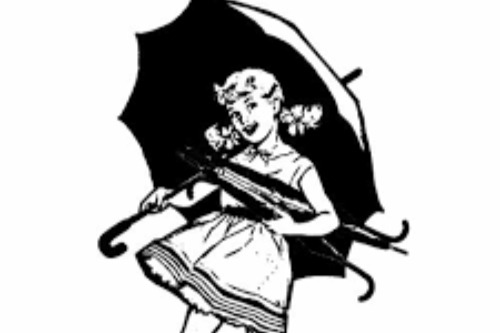
When the Morton Salt Girl appeared in 1914, she was part of a campaign to show how Morton’s salt “when it rains, it pours.” The image of a little girl carrying an umbrella while salt spilled behind her was simple but unforgettable. It illustrated the brand’s innovation—adding magnesium carbonate to keep salt from clumping. She gave a technical feature a human touch.
The Morton Salt Girl became a quiet symbol of reliability and progress. Her design has barely changed over a century, which adds to her nostalgic appeal. She represents consistency in an ever-changing market. In a way, she’s proof that even a simple household product can become an American cultural icon with the right face behind it.
11. The GEICO Gecko
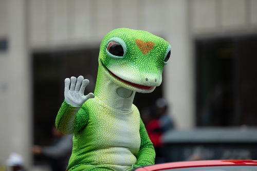
The GEICO Gecko was born out of a joke—the company’s name sounded like “gecko.” Introduced in 1999, the little lizard quickly became one of the most beloved ad mascots of modern times. His polite British accent and laid-back personality stood out amid loud, flashy car insurance commercials. He made a dull industry approachable and even funny.
Over the years, the Gecko became the face of a massive marketing empire. He symbolizes persistence, humor, and a bit of quirk—qualities that resonate with everyday Americans. What began as a one-off gag is now synonymous with GEICO’s entire identity. The Gecko shows how a talking reptile can sell both savings and smiles.
12. Ronald McDonald
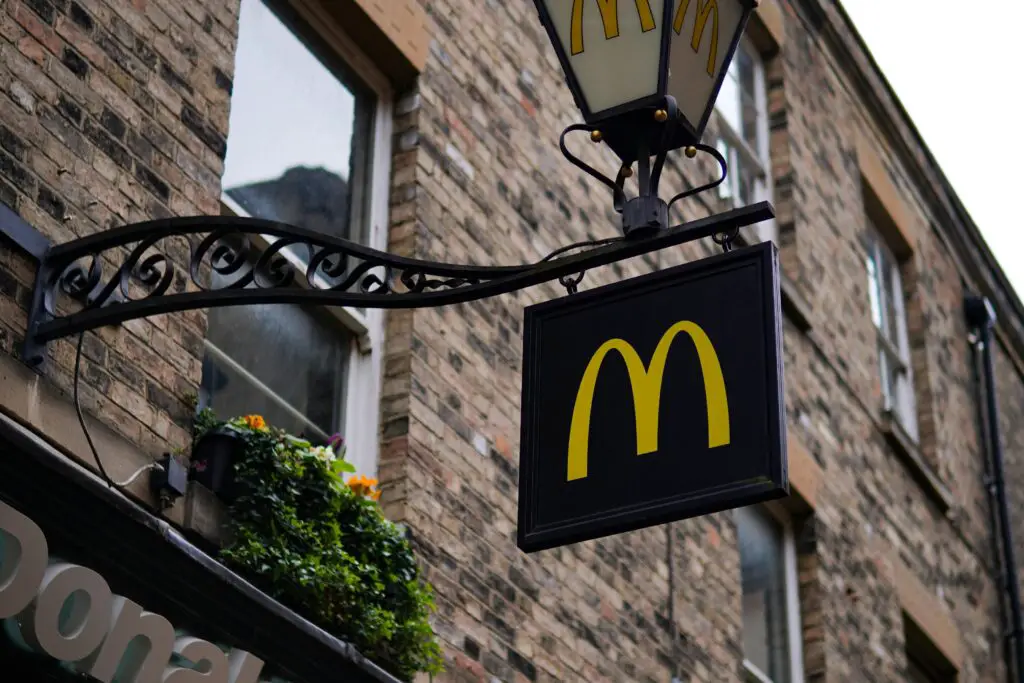
Ronald McDonald made his debut in the early 1960s as a way to make fast food more family-friendly. Originally played by Willard Scott, the clown’s colorful costume and cheerful antics were designed to appeal to kids. He quickly became the face of McDonald’s global empire, showing up in commercials, charity events, and even hospitals. Ronald wasn’t just selling burgers—he was selling joy.
Over time, Ronald McDonald grew into a symbol of both nostalgia and controversy. Critics accused him of marketing unhealthy food to children, but he also became the heart of Ronald McDonald House Charities, which supports families of sick kids. His red hair and big shoes are recognized worldwide, transcending his fast-food roots. Like many on this list, Ronald started as an advertising gimmick—but became something much larger.
This post 12 American Symbols That Started as Advertising Gimmicks was first published on American Charm.