1. New York City, New York (Manhattan Grid)
Walk through Manhattan and you can almost feel the logic under your feet. The 1811 Commissioners’ Plan laid out a strict grid of numbered streets and avenues that still defines how people move. Addresses tell you roughly where you are without needing a map. Even first-time visitors pick it up quickly because the system is so consistent.
That layout reflects a city built for growth, efficiency, and real estate expansion. It prioritized order over topography, flattening hills and ignoring natural features. The predictability makes navigation easy but can feel repetitive block after block. Still, it tells you everything about how the city was designed to function at scale.
2. Washington, D.C.

Washington, D.C. was designed to project power and intention. Pierre L’Enfant’s plan layered diagonal avenues over a grid, connecting major landmarks with sweeping sightlines. Circles and plazas create focal points that highlight government buildings. The layout feels ceremonial because it was meant to be.
You can sense hierarchy just by walking around. The Capitol, the White House, and the National Mall anchor everything visually. Streets often point you toward something important whether you realize it or not. It’s a city where the design reinforces the idea of a central government.
3. Salt Lake City, Utah

Salt Lake City’s streets are famously wide, and there’s a reason for that. Early Mormon settlers, led by Brigham Young, planned the city with oversized blocks and roads. The idea was to accommodate wagons turning around easily. That frontier practicality still defines the city’s feel today.
The grid is anchored by Temple Square, which acts as a central reference point. Addresses are based on distance from that center rather than arbitrary names. It gives the city a sense of order rooted in community planning. You can tell it was built deliberately, not organically.
4. Savannah, Georgia

Savannah’s layout stands out because of its repeating public squares. Designed by James Oglethorpe in the 1700s, the city is organized into ward-like units. Each includes a central green space surrounded by homes and civic buildings. It creates a rhythm that feels both structured and relaxed.
Walking through Savannah means constantly arriving at another shaded square. The design encourages community interaction and walkability. It also breaks up the urban environment in a way that feels human-scaled. You can see how early planning emphasized livability.
5. Chicago, Illinois

Chicago’s grid is one of the most precise in the country. Streets follow a strict north-south and east-west orientation anchored at State and Madison. Addresses increase predictably as you move away from that. It’s a system that makes navigation surprisingly intuitive.
The layout reflects a city rebuilt and standardized after the Great Chicago Fire. Planning emphasized efficiency and expansion. Even alleys were incorporated into the design for service access. The structure tells you Chicago was engineered to work.
6. Boston, Massachusetts

Boston feels completely different from grid-based cities. Its streets twist and turn because they evolved from colonial paths and old cow trails. There was no master plan imposing order from the start. The result is a layout that feels organic and sometimes confusing.
That complexity tells you Boston grew gradually over centuries. Land was filled in, roads were rerouted, and neighborhoods developed independently. You navigate more by landmarks than street logic. The layout reflects history layered on top of itself.
7. Los Angeles, California

Los Angeles spreads out in a vast network of grids connected by freeways. The layout prioritizes cars, with wide roads and long distances between destinations. Neighborhoods feel like separate nodes rather than one continuous urban core. It’s a city built around movement.
The freeway system acts as the real backbone of navigation. Addresses matter less than which exit you take. The design reflects postwar growth and automobile dominance. You can tell the city was built for driving first.
8. Philadelphia, Pennsylvania

Philadelphia was one of the first American cities planned with a grid. William Penn designed it with wide streets and public squares to prevent overcrowding. The layout was meant to promote order and public health. It still shapes how the city feels today.
Center City remains easy to navigate because of that early planning. Broad Street and Market Street form a clear cross-axis. Parks and squares break up the density. The design reflects Enlightenment-era thinking about urban life.
9. San Francisco, California

San Francisco’s grid famously ignores its steep hills. Streets run straight up and down terrain that probably should have been worked around. The result is dramatic slopes and unexpected views. It’s visually striking but sometimes impractical.
That choice reflects rapid expansion during the Gold Rush. Efficiency and land division took priority over comfort. Cable cars and stairways later adapted to the terrain. The layout shows how quickly the city grew.
10. Phoenix, Arizona

Phoenix is built on a massive, consistent grid that stretches across the desert. Streets are wide, straight, and evenly spaced. Navigation is straightforward because the system rarely breaks. It feels almost infinite as you drive through it.
That layout reflects modern suburban expansion and car dependence. Development spread outward rather than upward. The grid made it easy to divide land and build quickly. You can see the logic of growth in every direction.
11. New Orleans, Louisiana
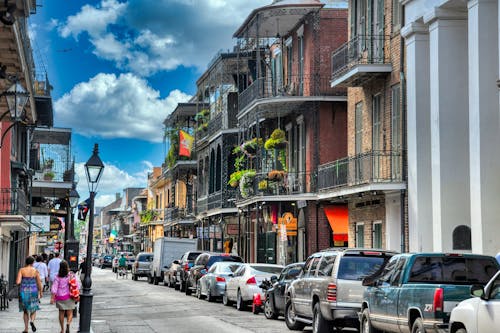
New Orleans has a layout shaped by geography as much as planning. The Mississippi River curves through the city, bending neighborhoods with it. Streets follow the natural landscape rather than forcing a rigid grid. The French Quarter, in particular, reflects older colonial patterns.
Flood risk and elevation have always influenced development. Some areas sit higher and were historically more desirable. The layout reveals how people adapted to the environment. It’s a city where geography writes the map.
12. Las Vegas, Nevada

Las Vegas is organized around the Strip, which acts as its main axis. Resorts line this corridor in a way that feels almost theatrical. The layout prioritizes tourism and spectacle over traditional city structure. Everything is designed to guide visitors through experiences.
Away from the Strip, the city spreads into suburban grids. But the main identity comes from that central stretch. It tells you exactly what the city is built for. The design makes its purpose obvious at a glance.
13. Honolulu, Hawaii

Honolulu’s layout is shaped by mountains on one side and ocean on the other. Development stretches along narrow corridors where land is available. Major roads run parallel to the coastline. The geography limits how the city can expand.
Neighborhoods feel linear rather than sprawling in all directions. Traffic patterns reflect those natural constraints. You can see how the environment dictates movement and growth. The layout tells you the land is in charge here.
This post American Places Where the Layout Tells You Everything was first published on American Charm.