1. The Portland Building – Portland, Oregon
The Portland Building is a well-known example of postmodern architecture, but it’s also one of the most divisive buildings in the U.S. Designed by Michael Graves, its bright colors, quirky design, and clunky details have earned it a reputation for being ugly. While some admire its whimsical qualities, many think its chaotic design clashes with the surrounding area and feels like a cartoonish mistake.
2. The MetLife Building (New York, NY)
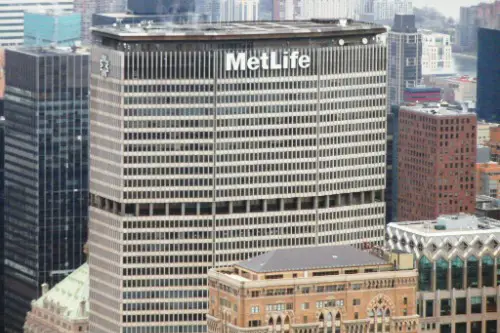
Standing tall in midtown Manhattan, the MetLife Building’s shape is often compared to a giant boxy eyesore in the sky. Its sheer size dominates the skyline, but its drab, uninviting exterior gives it a cold, institutional feel. It’s like the building itself is saying, “I’m important,” but without any charm.
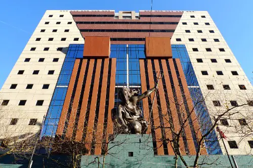
3. The Franklin D. Roosevelt Memorial – Washington, D.C.

While it’s an important historical landmark, the Franklin D. Roosevelt Memorial in D.C. has often been deemed an eyesore by critics. The large, jagged granite slabs and the somber, uninviting design make the memorial feel more like a monument to coldness rather than a tribute to one of the nation’s most beloved presidents. Many people feel it lacks the warmth and dignity fitting for such a memorial.
4. The J. Edgar Hoover Building (Washington, D.C.)
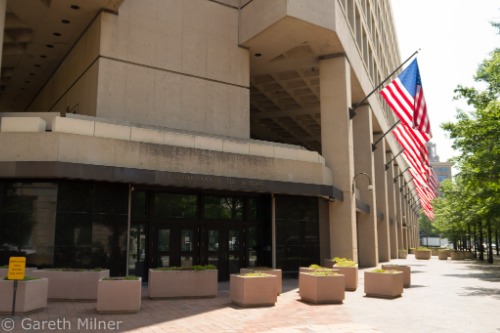
Named after the notorious FBI director, this building’s brutalist style doesn’t exactly exude grace. Its concrete façade, jagged edges, and overall menacing look make it feel like something you’d encounter in a dystopian movie. Rather than being a symbol of law and order, it feels more like a reminder of an era best left in the past.
5. The One World Trade Center (New York, NY)

While the One World Trade Center is a modern marvel in many respects, it has also been called a “monolithic” structure by critics. The narrow design and tall, tapering shape, while symbolizing resilience, leave a lot of people with the impression that it’s just too big and too bland for such a significant location.
6. The U.S. Embassy (London, UK – and kind of in America, right?)
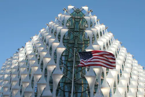
Okay, this one’s technically in London, but it’s so infamous for its ugly design that it’s worth mentioning. Its boxy, glass-heavy, and dull structure feels like something slapped together without any regard for the environment. It’s a glaring mismatch against the traditional elegance of London’s cityscape.
7. The Houston Astrodome (Houston, TX)
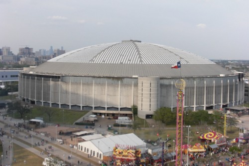
Often called the “Eighth Wonder of the World,” the Houston Astrodome is a sad reminder of what happens when a building becomes obsolete. Its giant, clunky structure is hard to ignore, and it was ahead of its time when it was first built, but now it just looks like an old relic begging for a renovation.
8. The Boston City Hall (Boston, MA)
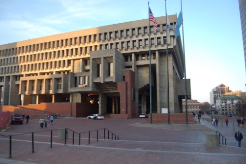
Brutalism is certainly a love-it-or-hate-it style, and Boston City Hall falls squarely in the “hate it” camp for many. With its harsh, angular concrete shapes and imposing presence, it’s a building that feels more like a fortress than a public space. It’s more foreboding than welcoming.
9. The Bay Area Rapid Transit (BART) Stations (San Francisco, CA)
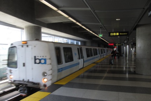
The BART stations in the Bay Area are notorious for their utilitarian, boxy design. Concrete and steel dominate these structures, which feel more like tunnels than transit hubs. The aesthetics of these stations may have been more about functionality than beauty, but they leave much to be desired.
10. The Willis Tower (Chicago, IL)
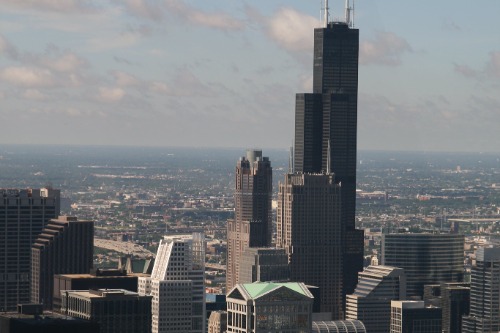
Previously known as the Sears Tower, the Willis Tower is iconic for its height, but not necessarily for its good looks. Its black steel and boxy silhouette can come off as stiff and dull. It’s as if someone built a skyscraper with no regard for making it look inviting or inspiring.
11. The Vdara Hotel (Las Vegas, NV)
Las Vegas is known for its flashy and over-the-top architecture, so the Vdara Hotel’s sleek but sterile design sticks out like a sore thumb. Its reflective glass exterior may look nice from afar, but up close it just seems cold and out of place compared to the city’s vibrant, colorful landscape.
12. The FBI Building (Washington, D.C.)
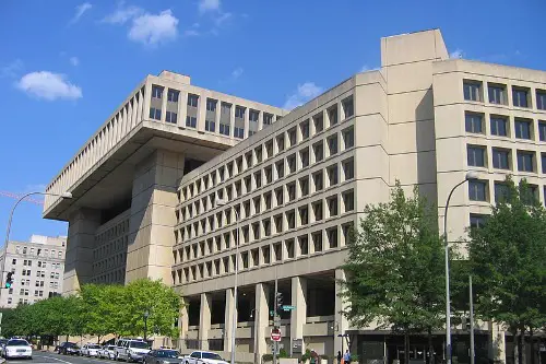
The FBI building in Washington, D.C. is another brutalist example that feels like a fortress rather than a functional office. The rigid lines, concrete slabs, and overall severity make it a tough sight to behold, and it’s a perfect reflection of a time when architecture was about power, not aesthetics.
13. The Denver International Airport (Denver, CO)

You’ve probably heard the rumors: the weird design of the Denver International Airport isn’t just a quirky aesthetic choice—it’s downright off-putting. The giant white peaks that look like tents? They’re supposed to evoke the Rocky Mountains, but instead, they often get compared to alien spaceships or, in some eyes, just a big mess. Plus, the airport’s mysterious murals don’t help its case.
14. The Georgia State Capitol (Atlanta, Georgia)
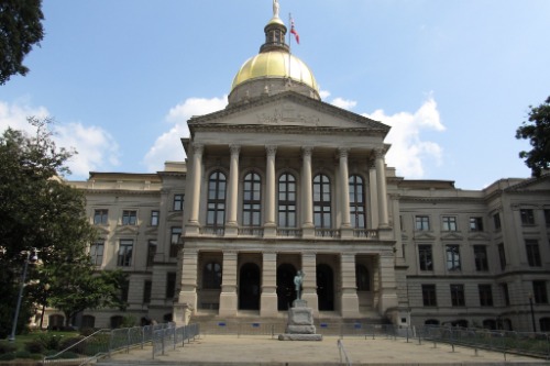
Though it’s a historic building and a symbol of Georgia’s government, the Georgia State Capitol has often been criticized for its outdated, uninspired design. The heavy dome and the boxy, utilitarian structure give off an institutional vibe that doesn’t exactly inspire awe. Some critics argue that its dull appearance doesn’t match the grandeur of other state capitols around the country.
15. The Brutalist Courthouse (New York, NY)
Brutalism strikes again! The New York Courthouse is a stark, intimidating structure that is more interested in being powerful than pretty. Its concrete exteriors and cold, imposing lines make it feel less like a place of justice and more like a punishment in architectural form.