1. Pepsi
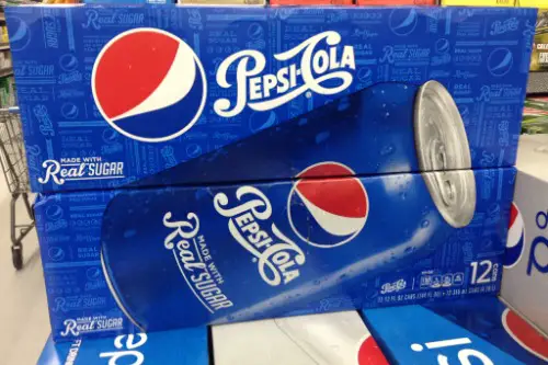
Pepsi’s logo has seen more makeovers than most celebrities, according to Abbey Bamford from Design Week. It started in 1898 with an elegant red script that looked like it belonged on a soda fountain menu. Over the years, it embraced patriotic themes, especially during WWII, adding the now-iconic red, white, and blue color scheme. But the biggest shift came in 2008, when the logo was modernized into a minimalist globe with a tilted white band, representing a smile (according to Pepsi, anyway).
The change wasn’t just aesthetic—it was strategic, aiming to modernize the brand and compete more directly with Coca-Cola. The shift to lowercase typography and a softer, rounder design signaled a new era. Some loved the sleek look; others missed the vintage charm. Either way, Pepsi’s evolving logo tells the story of changing American design tastes.
2. Apple
Okay, yes—Apple is now a global icon, but it’s rooted in California and deserves a spot here. The first Apple logo in 1976 looked like an old-school etching of Isaac Newton sitting under a tree, and honestly, it was a lot. A year later, the iconic rainbow apple silhouette replaced it, representing innovation and a more user-friendly vibe. That rainbow stuck around until 1998 when Steve Jobs returned and ushered in the monochrome version we know today.
Each version of the Apple logo mirrored where the company was at the time—idealistic in the ’70s, playful in the ’80s and ’90s, and sleek in the 2000s, Adí Aviram from Linearity explains. The flat, silver-toned apple we see now is all about minimalism and professionalism. It’s a far cry from Newton and his apple tree. But it still holds that same core shape that’s become instantly recognizable worldwide.
3. Ford
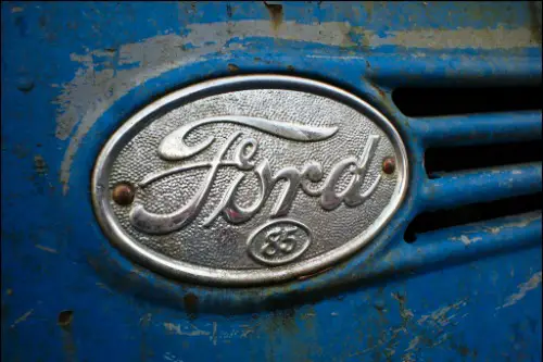
Ford’s classic blue oval is one of the most enduring symbols in American automotive history. But the very first logo from 1903 was nothing like the one we know today—it was black and gothic-looking, almost like it belonged on a Victorian book cover, according to Sebastien Bell from Carscoops. By 1927, the blue oval came into play, and the “Ford script” that we’re familiar with had already started to take shape. The script itself dates back to 1909, and it’s largely stayed the same since then.
The biggest evolution has been in the shape, shading, and polish of the oval. Modern updates added gradients and chrome effects to reflect Ford’s push toward innovation and sleek design. The logo tweaks have always tried to strike a balance between heritage and progress. It’s proof that even a classic can evolve without losing its identity.
4. McDonald’s
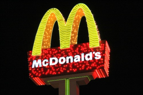
McDonald’s didn’t always have the Golden Arches front and center, according to Mary Kyamko from Crowdspring. Its earliest logos in the 1940s were simple black-and-white designs with the full name spelled out, and no arches in sight. The arches themselves were inspired by the actual architecture of an early franchise location in Phoenix. In 1961, designer Jim Schindler turned them into a stylized “M,” and that’s when things clicked.
Over time, the logo dropped all the extra text and focused solely on the arches. By the early 2000s, the brand fully embraced the minimalist trend and introduced the “I’m lovin’ it” slogan alongside a streamlined arch. It’s a perfect example of how branding and architecture can influence each other. Now, that big yellow “M” is recognized across the globe, no name necessary.
5. Coca-Cola
Coca-Cola’s script logo might look timeless, but it’s had a few touch-ups over the years. The original 1886 version was actually pretty close to what we see now—thanks to Frank M. Robinson, who designed the Spencerian script. But there were brief moments in history where Coca-Cola tried more modern typography, especially in the ’80s and early ’90s. These deviations were always met with a lukewarm response, and the brand would quickly revert to the classic look.
One of the biggest missteps came with the “New Coke” rebranding in 1985, which included subtle logo tweaks. Consumers didn’t buy it—literally—and the backlash brought the old formula and design back. That reaction showed just how iconic the Coca-Cola script had become. Today, the logo is cleaner and more digitally friendly, but it stays true to its roots.
6. Starbucks
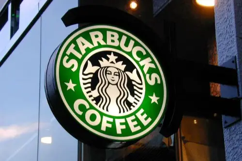
The original Starbucks logo in 1971 was a brown, full-bodied mermaid with, let’s just say, a lot more detail than today’s version, according to Mar Aguilar Giron from The Branding Journal. Inspired by a 16th-century Norse woodcut, the siren originally had a very vintage, nautical feel. In 1987, the brand updated the color to green and added a black circle around her. Her anatomy was also significantly toned down—family-friendly branding, anyone?
Starbucks has continued to refine the siren, making her less busy and more approachable. In 2011, they dropped the wordmark entirely, leaving just her face in green and white. The minimalist move showed just how recognizable she’d become. The evolution from seafaring art to sleek modern icon mirrors Starbucks’ shift from Seattle coffeehouse to global empire.
7. General Electric (GE)
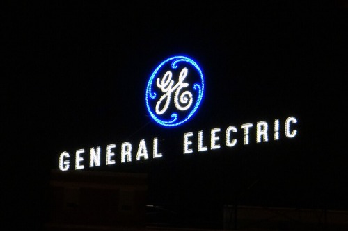
GE’s swirling monogram is a classic, but it wasn’t always this stylized. The original 1892 design was more utilitarian and straightforward, focusing on the company name. The curly, Art Nouveau-inspired monogram was introduced in the early 1900s and quickly became iconic. Over time, the logo’s flourishes were smoothed out, but the core design has remained surprisingly consistent.
Recent updates have focused on digitizing the logo, adjusting the line weights and spacing for better readability online. GE’s shifts reflect its transformation from a manufacturing giant to a player in the digital and energy sectors. They’ve modernized without abandoning tradition. That swirl still stands for American innovation after more than a century.
8. IBM
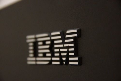
Before it was IBM, the company was called Computing-Tabulating-Recording Company (CTR), and the logo looked like a railroad company emblem. When CTR became IBM in 1924, the logo changed to a more straightforward serif font. In 1956, legendary designer Paul Rand introduced the solid black IBM letters, giving the company a bold, modern identity. Then in 1972, Rand updated it with horizontal stripes to suggest “speed and dynamism.”
That striped logo is still in use today, pretty much unchanged. It reflects IBM’s legacy of innovation in computing, while still feeling classic. The simplicity and precision of the design helped establish IBM as a serious, trustworthy name in tech. And despite tech trends changing constantly, IBM’s look has aged incredibly well.
9. AT&T
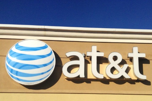
AT&T’s logo journey feels like a tour of modern graphic design history. The original Bell logo from 1889 was a literal bell inside a circle—plain and old-fashioned. In 1983, after the breakup of the Bell System, designer Saul Bass created the globe logo that became instantly recognizable. The striped sphere was meant to show connectivity and global reach.
Since then, the globe has been refined and 3D-ified, reflecting AT&T’s move into digital and wireless technologies. The most recent updates emphasize simplicity and digital friendliness, flattening the globe for screen use. AT&T’s visual changes mirror its business shifts from landlines to wireless to media. It’s a great example of how a logo can evolve alongside a company’s identity.
10. Shell
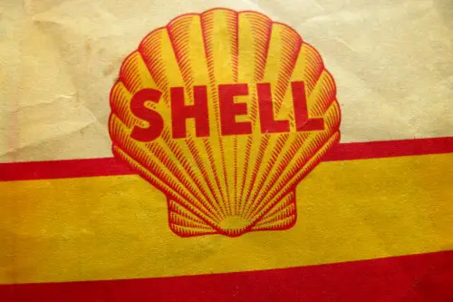
Shell’s logo started out as—you guessed it—a literal seashell. Back in 1900, it was a realistic drawing of a mussel shell, and later, a scallop shell. In 1948, the company went with a bold yellow-and-red color scheme, partly to appeal to California motorists and partly to stand out. Since then, the shell shape has been streamlined over the decades into the bright, graphic icon we know today.
The most notable change came in the 1970s when the logo dropped the company name entirely. It was confident branding—Shell believed the shape alone was recognizable enough. Today’s version is flat, clean, and totally text-free. It’s a masterclass in using color and shape to create a universal symbol.
11. UPS
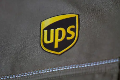
UPS originally had a very formal logo—think shield, eagle, and all the bells and whistles you’d expect from a 1916 company. In the 1930s, it switched to the familiar brown shield with “UPS” across it, emphasizing trust and reliability. Then, in 1961, legendary designer Paul Rand reimagined the logo again, adding a string-tied package above the shield. It was quirky, modern, and instantly iconic.
But in 2003, UPS dropped the package and introduced a sleeker, gold-toned shield to reflect a more professional, tech-savvy image. The rebrand was controversial among design fans, but it made sense for a company expanding into logistics and supply chain solutions. The brown and gold combo remains distinctive and memorable. And while some miss the old package, the new look is all about moving forward.
12. Burger King
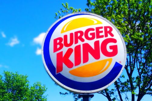
Burger King has bounced around more than most when it comes to logos. The original logo in the 1950s was very text-heavy and didn’t even have a burger. The 1969 version introduced the iconic “bun” logo with the brand name sandwiched in the middle, which stuck around for decades. In 1999, Burger King gave it a swooshy, 3D update to look more “extreme” and modern.
But in 2021, the chain went retro again, bringing back a flat version of the bun logo with bold colors and chunky type. It’s nostalgic but feels fresh at the same time. This back-to-basics move was meant to emphasize simplicity and real ingredients. The logo glow-up matched a bigger shift in branding toward authenticity and transparency.
13. Chevrolet
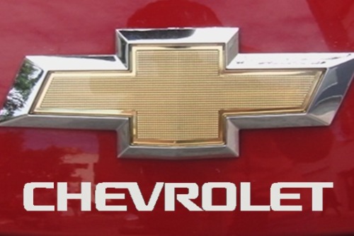
Chevy’s bowtie logo has a mysterious origin—some say it was inspired by wallpaper in a Paris hotel, others by a coal ad. Whatever the truth, the bowtie first appeared in 1913 and has stuck around ever since. But it’s changed shape, color, and texture plenty over the decades. From flat black-and-white versions to gold, 3D, and chrome-heavy versions, each iteration reflects a different era of American car culture.
In recent years, Chevy has gone back to a flatter, more digital-friendly bowtie, often in monochrome. The updates help it scale better across screens and marketing materials. But the bowtie itself remains iconic and untouched in spirit. It’s a design that’s driven through a century of change and still feels proudly American.
14. Disney
Disney’s original logo in the 1920s featured Mickey Mouse and looked more like a title card from a silent film. It wasn’t until the 1980s that the famous Cinderella Castle appeared, accompanied by that swirling Disney script. Over time, the castle has become more detailed and dramatic, especially for movie intros. In 2006, a fully animated, 3D version debuted with fireworks and a moat—it was pure magic.
The logo has since been tweaked for clarity and screen optimization, but the basic elements remain. For streaming and branding, simplified versions of the castle and script are used. Disney’s logo evolution mirrors its shift from traditional animation to global entertainment powerhouse. It’s a fairy tale that grew up but never lost its sparkle.
15. Levi’s
Levi’s earliest logos were all about durability—think two horses trying to pull apart a pair of jeans. That “Two Horse” logo was introduced in 1886 and is still used subtly today. In 1936, the iconic red tab was added to the back pocket, instantly distinguishing Levi’s in a crowded market. But the biggest branding move came in the 1960s with the introduction of the “batwing” logo.
Designed by Walter Landor, the batwing mimics the shape of the jeans’ back pocket stitching. It’s simple, symmetrical, and instantly recognizable. Over the years, Levi’s has flattened and modernized it, ditching outlines and embracing bold red and white. The brand’s identity has gone from rugged workwear to timeless fashion—with a logo to match.