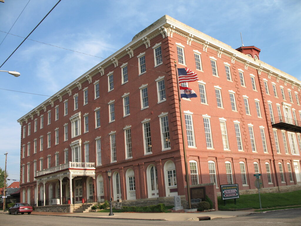
1. The Portland Building – Portland, Oregon
The Portland Building is a controversial piece of postmodern architecture that leaves many people scratching their heads. Designed by Michael Graves, this colorful and eccentric structure is often hailed for its whimsical approach, but it just doesn’t seem to fit in its environment. The clunky details and the over-the-top colors clash with the surrounding Portland skyline, creating a sense of discord. While some may defend its playful spirit, the general consensus is that it’s more cartoonish than charming, according to Douglas Perry from The Oregonian.
Its chaotic design feels like a misstep in the pursuit of a timeless urban landscape. The bright palette might have been trendy at one point, but now it just looks like an accident in the middle of the city. It’s a building that demands attention, but not in the way architects might have hoped. Instead of contributing to the city’s visual culture, it feels like an out-of-place relic.
2. The MetLife Building (New York, NY)
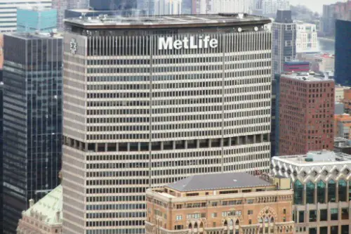
The MetLife Building stands tall in the heart of New York City, but it’s also a standout for all the wrong reasons, according to Russell Poole from City Signal. With its huge, boxy shape and dull exterior, it stands as a monument to uninspired skyscraper design. The building’s enormous size feels like it dominates the skyline in a way that is more oppressive than impressive. It may have been built with utility in mind, but its lack of visual appeal has earned it the nickname “the giant shoebox.”
In a city full of iconic, artfully designed buildings, the MetLife Building sticks out like a sore thumb. Its bulky, featureless design feels like a missed opportunity to make a positive architectural statement. Instead of being a symbol of innovation, it’s more of a reminder that size doesn’t always equate to beauty. It’s the kind of building you notice only because it’s so remarkably bland.
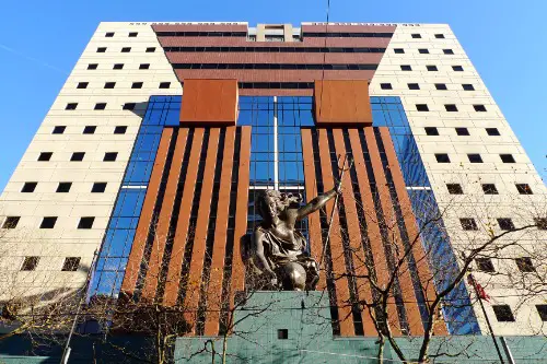
3. The Franklin D. Roosevelt Memorial – Washington, D.C.

The Franklin D. Roosevelt Memorial in Washington, D.C., is often considered a major disappointment in terms of design. Instead of evoking a sense of hope and inspiration, its jagged granite slabs and cold, minimalist design make it feel more like a dystopian monument. The memorial’s somber, harsh look doesn’t capture the warmth and optimism that Roosevelt embodied during his presidency. It’s as if the design was intended to make visitors feel uncomfortable, which is the opposite of what a tribute to a beloved president should achieve.
Additionally, the memorial is criticized for its lack of welcoming qualities. Rather than inviting reflection and reverence, the structure feels more like a fortress than a place to honor FDR’s legacy. Critics argue that the design undermines the emotional resonance that such a significant memorial should offer. It’s a rare example of how too much minimalism can strip away the human touch needed in such an important space.
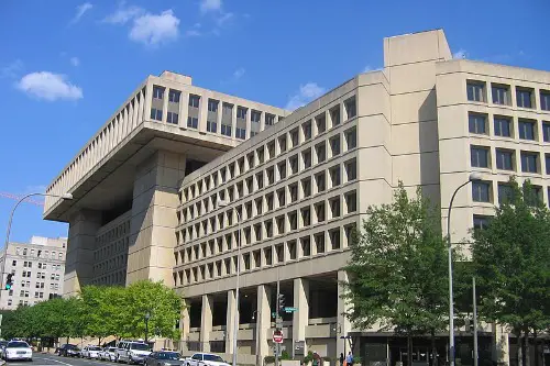
4. The J. Edgar Hoover Building (Washington, D.C.)
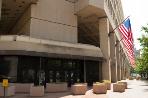
The J. Edgar Hoover Building is a prime example of the Brutalist architectural style, but it doesn’t exactly charm anyone who lays eyes on it, Jessica Ruf explains in Washingtonian. With its raw concrete exterior and sharp, jagged lines, it feels more like a fortress than a government office. This imposing structure gives off a sense of unease rather than trust, which isn’t ideal for the FBI headquarters. The building’s severity is likely a nod to the power of the agency, but it only succeeds in making the structure feel cold and unapproachable.
As a symbol of law and order, the Hoover Building succeeds in being imposing, but it fails as a work of architectural beauty. The Brutalist design doesn’t offer any relief from its harshness, making it a difficult building to appreciate. It’s the kind of structure that feels more like an error in design than an intentional artistic statement. Instead of feeling proud and dignified, the building leaves visitors with a sense of discomfort.
5. The One World Trade Center (New York, NY)
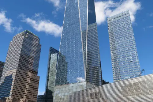
The One World Trade Center, while a symbol of resilience, has been the subject of debate over its architectural merit, Connor Simpson from The Atlantic explains. Critics argue that the tower’s design is overly monolithic, with its narrow, tapering shape making it look too cold and impersonal. While it may symbolize the nation’s strength, it feels somewhat unremarkable in terms of aesthetic appeal. The building’s sheer size dominates the skyline, but the lack of intricate design elements makes it feel more like a blunt instrument than a creative feat.
For such a significant location, One World Trade Center has been called a missed opportunity in terms of urban design. Its simplistic design does not stand out as an iconic symbol of hope or renewal, and some feel it lacks the vibrancy and uniqueness that the area deserves. Instead of creating something truly extraordinary, the building has left many with the impression that it’s just a huge, uninspiring structure. In the end, its towering presence fails to match the grandeur of the original World Trade Center towers.
6. The U.S. Embassy (London, UK – and technically in America, right?)
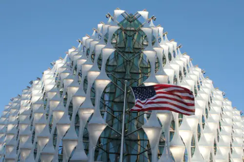
Though it’s technically not in the U.S., the U.S. Embassy in London is so infamous that it deserves a place on this list. The building’s glass-heavy, boxy design feels like it was thrown together with little thought for its surroundings. It stands in stark contrast to the traditional elegance of London’s architecture, making it a glaring mismatch in the city’s historic landscape. Rather than blending in, the embassy sticks out like an eyesore among the graceful, centuries-old buildings of London.
Architecturally, it’s a prime example of a building that looks like it was designed without any consideration for context. The boxy structure and uninspired design make it feel like a mistake rather than a dignified representation of the U.S. in one of the world’s most important cities. Rather than conveying the power and prestige of the U.S., it feels more like a soulless corporate building. In a city known for its stunning architecture, the U.S. Embassy’s design is a stark contrast that leaves much to be desired.
7. The Houston Astrodome (Houston, TX)
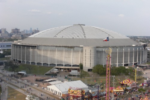
The Houston Astrodome once earned the title of the “Eighth Wonder of the World,” but today it stands as a symbol of outdated design. Once ahead of its time as the world’s first domed stadium, the Astrodome now looks like a relic from the past. Its massive, clunky structure doesn’t seem to fit into the modern landscape of Houston, and it’s clear that its time has passed. What was once an architectural marvel now feels more like a sad monument to a bygone era.
The building’s outdated design, while innovative in its time, has become a reminder of how quickly architecture can become obsolete. The Astrodome now sits in disrepair, with calls for renovation or demolition growing louder. Rather than serving as a symbol of progress, it has become an eyesore that does little to inspire. It’s a building that symbolizes how good ideas can age poorly if they’re not kept up with the times.
8. The Boston City Hall (Boston, MA)
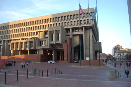
Boston City Hall is a glaring example of Brutalism gone wrong. Its jagged, angular concrete shapes are so imposing that it feels more like a fortress than a civic building. While Brutalism has its defenders, it’s hard to deny that Boston City Hall is one of the more unappealing examples of the style. The stark, heavy concrete gives the building an oppressive presence that feels more alienating than welcoming.
Rather than inviting the public to engage with the government, the building seems to push them away. Its cold, industrial feel makes it seem more like a prison than a place for civic engagement. For a city known for its history and charm, Boston City Hall stands out for all the wrong reasons. Instead of inspiring pride in the community, it leaves a lasting impression of discomfort and detachment.
9. The Bay Area Rapid Transit (BART) Stations (San Francisco, CA)
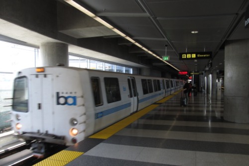
The BART stations in the Bay Area are often criticized for their uninspired and utilitarian design. The concrete and steel structures that house the stations feel more like underground tunnels than transit hubs. While functional, these stations lack any sort of aesthetic appeal, which is especially glaring when compared to the vibrant city around them. The design of the BART stations prioritizes practicality, but it does so at the expense of creating an environment that people want to experience.
Instead of offering passengers an inviting space, these stations leave much to be desired. The utilitarian nature of the design makes them feel cold and unwelcoming, which detracts from the overall transit experience. With their boxy, industrial appearance, the BART stations seem to scream “function over form” in the least attractive way possible. They serve their purpose, but not in a way that enhances the city’s visual or cultural landscape.
10. The Willis Tower (Chicago, IL)
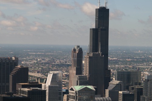
The Willis Tower (formerly the Sears Tower) is an iconic part of Chicago’s skyline, but it’s not exactly known for its elegance. With its black steel exterior and boxy, rigid design, it looks more like a monolith than a beacon of architectural beauty. While it may be the tallest building in the U.S. for a time, its plain appearance doesn’t make it a stand-out masterpiece. The lack of intricate details or creative flourishes makes it seem stiff and uninspired.
Although it’s a major landmark, the Willis Tower doesn’t inspire awe in the way other skyscrapers do. Its sheer size and square shape make it more of an obstacle to the skyline than a highlight. Rather than adding to the beauty of Chicago’s architectural landscape, it feels like a utilitarian addition that was built for function, not flair. The Willis Tower might be tall, but it’s also remarkably forgettable.
11. The Vdara Hotel (Las Vegas, NV)
The Vdara Hotel in Las Vegas stands out for all the wrong reasons, thanks to its sterile, soulless design. In a city known for its extravagant and flamboyant buildings, the Vdara is anything but eye-catching. Its sleek, reflective glass exterior might look impressive from a distance, but up close it feels cold and out of place. The hotel’s minimalist design stands in stark contrast to the colorful chaos that surrounds it.
Instead of blending in with the Vegas landscape, the Vdara feels like a misplaced structure. While the city is known for its bold, attention-grabbing architecture, this hotel just doesn’t have the same allure. Its sterile appearance doesn’t offer the same energy that other iconic Vegas buildings exude. In a city where excess is king, the Vdara feels like a weak attempt at modernity that fails to make a statement.
12. The FBI Building (Washington, D.C.)
Another brutalist structure on the list, the FBI Building in Washington, D.C. is an example of architectural style at its most oppressive. Its cold, concrete exterior and harsh, angular lines make it feel like a fortress rather than an office building. The design gives off an air of power, but it also makes the building feel like a relic from a time when form followed function in the least aesthetically pleasing way. It’s hard to imagine that anyone would find such a stark structure inviting.
The building’s aggressive design is more about showcasing strength than creating a welcoming space for visitors or employees. Its imposing presence may be fitting for the FBI, but it also feels like a poor reflection of the agency’s mission to protect and serve. The FBI Building’s brutalist architecture hasn’t aged well, leaving it as one of the most unappealing government buildings in Washington, D.C.
13. The Denver International Airport (Denver, CO)
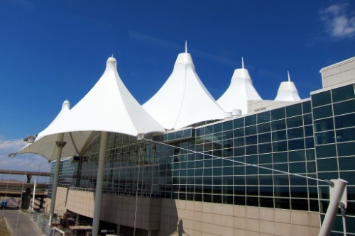
The Denver International Airport is a prime example of a building that’s both weird and unsettling. Its giant white peaks, designed to resemble the Rocky Mountains, often get compared to tents or alien spaceships. The bizarre roofline leaves many confused, and the overall design has earned the airport a reputation for being one of the strangest in the country. As if the weird design wasn’t enough, the airport is also home to a collection of mysterious murals that only add to the sense of unease.
The airport’s strange appearance doesn’t exactly make travelers feel welcome. Instead of offering a sense of comfort or excitement about their trip, the design feels off-putting and alienating. The airport may be functional, but its unorthodox design has left many questioning what the architects were thinking. It’s a building that stands out for all the wrong reasons, and its oddities haven’t aged well in the years since it was built.
14. The Georgia State Capitol (Atlanta, Georgia)
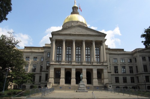
The Georgia State Capitol is a historic building, but its uninspired design has been criticized over the years. The structure’s heavy dome and boxy shape give it an institutional feel that doesn’t quite live up to the grandeur of other state capitols around the country. Rather than inspiring pride or awe, the building feels rather dull and outdated. Its lack of architectural elegance leaves much to be desired for such an important symbol of the state’s government.
Rather than showcasing the power and importance of Georgia’s leadership, the building’s plain design feels more like a functional structure than an architectural landmark. While it may serve its purpose, there’s little to admire in the building’s exterior. The Georgia State Capitol pales in comparison to the ornate designs found in other state capitals, making it feel like an afterthought in architectural terms.
15. The Brutalist Courthouse (New York, NY)
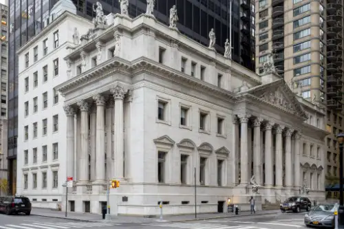
The Brutalist Courthouse in New York City is another example of the style’s failure to deliver beauty. The cold, imposing concrete exterior makes the building feel more like a punishment than a place for justice. The sharp, angular lines and the rigid, massive structure leave a lasting impression of severity. Instead of being a space that promotes fairness and accessibility, the design of this courthouse makes it feel less like a place for the people and more like an intimidating fortress.
The courthouse’s design serves as a reminder of a bygone era when architecture was more about power and control than human experience. It might have been intended to command respect, but it just ends up feeling harsh and unwelcoming. The building’s lack of warmth or inviting qualities makes it an example of how Brutalism can go horribly wrong. It’s a place that inspires fear rather than the trust it should instill in those seeking justice.